Building a Scalable Design System from the Ground Up
Multi-brand, multi-platform design system implementation
Overview
Team: Product Manager, Snr. UX/UI Designer (me), User Researcher, Multiple Engineering Teams, Stakeholders
Role: Lead UX/UI Designer & Design System Architect
Tools: Figma, Zeplin, Storybook, Zeroheight
The Problem
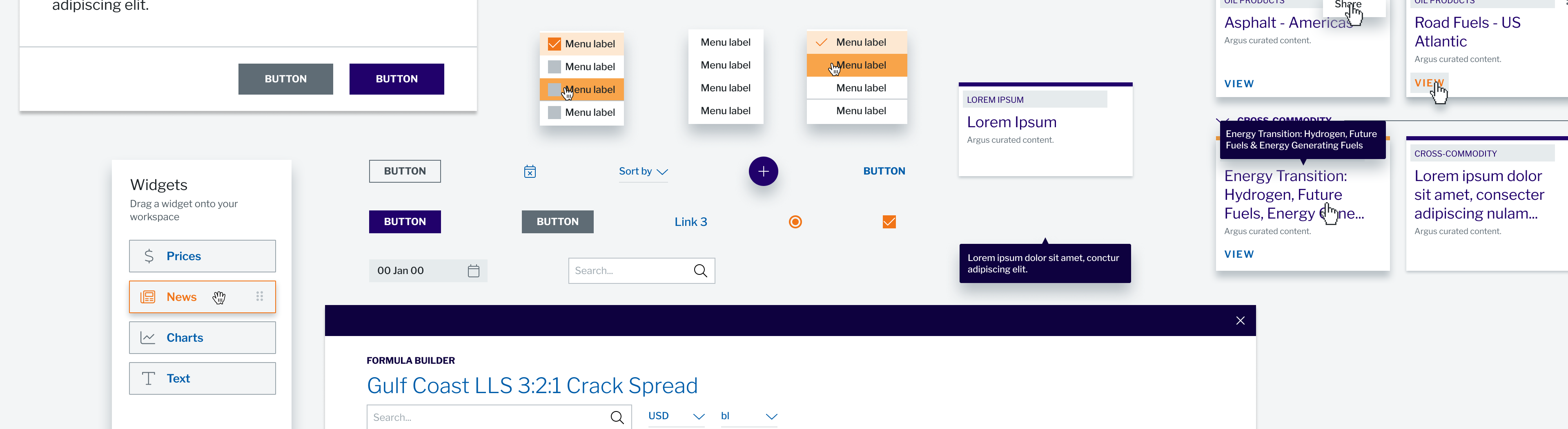
Disparate UI designs across multiple products created development inefficiencies and inconsistent user experiences. Development teams recreated similar components repeatedly while designers lacked unified visual language for scaling across brands and platforms.
Company growth required faster design-to-development workflows that fragmented approach couldn't support, with audit revealing mulitple component variations impacting business objectives around rapid iteration and multi-brand expansion.
My Role
Led the UX/UI design and the design system architectecture responsible for strategy, implementation, and governance across multiple product areas. Collaborated with engineering leads, product managers, and several other designers while facilitating stakeholder alignment and driving adoption.
Accountable for UI audits, component libraries, design tokens, Figma systems, and cross-functional workshops within agile methodology.
How I came to my solution
Conducted UI audit across all products and interviewed teams to identify patterns, inconsistencies, and workflow inefficiencies. Research revealed need for gradual implementation with immediate value demonstration rather than complete system overhaul.
Evaluated component-first versus token-first strategies against adoption feasibility and technical constraints, validating each phase through developer feedback and stakeholder workshops.
How my solution solved the problem
Phased implementation addressed immediate developer needs with standardized components, centralized color management, and comprehensive Figma system for design and developer alignment aswell as designer onboarding. Multi-platform extension enabled unified experiences while advanced token architecture allowed single components to support multiple brands.
System governance established sustainable processes for version control and continuous improvement, aligning with business objectives for accelerated workflows and multi-brand expansion.
Figma
Storybook
Effects to the users and the business
Significant increase in design creation speed with a noticable reduction in front-end development time, significant increase in the design/devlepment consistency, and successful onboarding of nulitple new designers. Eliminated redundant components while reducing new brand theme deployment from months to days.
System supports 5+ teams daily with improved design-development collaboration and increased designer autonomy, becoming foundation for company's multi-brand expansion strategy.